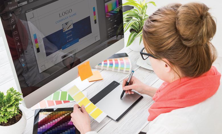
How to Develop the Ideal Logo Like A Professional Graphic Designer
We’ve touched on expert graphic designers a little in a few of our earlier posts. And more precisely, we recently discussed the advantages of using logo creation software versus hiring a graphic designer and the differences between the two. as opposed using a graphic designer.
The use of a graphic designer has benefits. You select a candidate with training in logo design, graphics, and development for your project. They are proficient in the fundamentals of color theory, composition, graphic design trends, and efficient visual communication techniques. All of these factors contribute to the high cost of hiring a professional logo designer: you are paying for their knowledge and years of experience in creating effective visuals. Fortunately, you can avoid spending all that money while still creating a fantastic logo if you learn how to think like a graphic designer.
A logo will be viewed differently by a professional than by the common individual. Most of the time, when we see a logo, we just think, “It’s nice,” “It’s ugly,” or we can think, “It’s a good reflection of that firm, or it’s not.” A graphic designer carefully considers the colors of the brand that the intended logo would represent when creating it. They look at the logo’s shapes and how they match or contrast with the brand’s chosen fonts. Speculate on how this logo would appear in print, on a computer screen, and in black and white. Frequently consider how they could have improved the logo if they had been given the opportunity.
Take some time to understand how to think about your logo professionally if you’ve chosen to create your own utilizing a logo builder program. It won’t cost you anything but can pay you a lot after you create a gorgeous, extremely professional-looking logo that shows your company.
Learn How to Create Logos for Yourself.
Learning how to distinguish between the components of each logo will be the first step in this process. If you haven’t already, please read our articles on the fundamentals of logo design before continuing:
The significance of colors and how they are used in brand identity design
The 30 greatest typefaces to build a spectacular logo
The meaning of geometric shapes in logo design
It is also crucial to acquaint yourself with different types of logos so that you can simply identify them when you come across them.
You’ll understand how important this topic is to brand recognition as you learn how graphic designers use colors, fonts, and geometric shapes in logos. When creating a logo, you include your firm’s price range, target clients, industry position, and geographic location.
The first step in learning how to critically analyze a logo, and be able to think like a professional graphic designer, is to learn how graphic choices communicate and reflect the values of a brand. Try to recreate brand logos yourself as a useful activity after learning how these graphic elements function. Create two or three fictitious companies, such as a modern plumbing company that caters to ethical consumers or a dog-walking and sitting service that distinguishes itself by offering playtime and socializing opportunities for dogs during the holidays. Walks. Then try creating your own logos for these companies with our logo builder.
DETERMINE A BRAND’S OBJECTIVES BY LOOKING AT ITS LOGO ALONE
After making a few practice logos, you’ll have a better idea of how to come up with a good logo. Now you can challenge yourself by looking at the problem from a different angle. You might find it fun to think about whether the logos you see every day do a good job of expressing the brand’s identity and values.
Examine the nearby logos the next time you go shopping. For example, look at the McDonald’s logo. The two yellow arches are readily recognizable all across the world. What does this say about the McDonald’s brand, in your opinion?
They don’t cost a lot. They provide unhealthy cuisine that is also convenient. Not exactly a foodie’s delight, this food is not only convenient but also relatively simple and designed to cause a dopamine surge thanks to fat and salt. Additionally, McDonald’s is the ideal restaurant to get a quick family meal if you have children.
Examine how McDonald’s conveys the ideals we just outlined, using nothing more than their logo, by repurposing your knowledge of how colors, forms, and fonts all function together in a design.
They went for yellow, a cheery color that exudes life and vitality. The M’s rounded, rather than pointed, arches make it appear friendlier and more appealing. Two colors and a few lines make up the logo’s basic design. simple at first.
Now Contrast This Messaging with That of Brooks Brothers.
How will the world view Brooks Brothers with a police logo?
Compare what these logos indicate about the brands they represent to your earlier impressions. Check online reviews and ask friends about things to see if your opinion is shared. Occasionally, no. Some logos don’t convey the brand’s ideals for a few reasons.
To think like a professional graphic designer, practice by analyzing and comparing various logos.
A logo that reflects a foreign brand’s culture may not properly communicate brand identity. In China, crimson symbolizes luck. South Africans associate red with sadness. For a Western audience, green conveys luck instead of red because it’s associated with money and invokes ideas of winning the lottery.
When the brand moved into new markets, the logos needed to be updated to accommodate a global audience. When establishing a logo, consider colors and pictures. Understand the cultural associations in each market where you operate. By focusing on one market, you risk designing a brand that means something different in another.
Finally, a logo may not be appropriate if it’s not good. Maybe the typeface or color doesn’t match the brand. It’s too straightforward and generic to be remembered for long. These poor logos will be visible if you think like a graphic designer.
Understanding How To Spot Quality Logos When You See Them
It is frequently unclear what makes a logo effectively created or what makes it so outstanding. This is due to the fact that skilled graphic designers understand how to quietly convey a brand’s values through graphic choices. Consider the Disney logo, for instance.
He is well-known to all of us. Even with his eyes closed, we can see him. Why does the Disney logo work so well?
Let’s first consider what it conveys. What would you say Disney is? Is it fun or not? Will the entire family enjoy it? It’s tidy? Is it a cultural juggernaut of the present?
Let’s concentrate on one feature that Disney has established a trademark it’s family-friendly. There are many movie studios nowadays, but Disney is the one that parents and other caregivers immediately think of when they want something high-quality and reasonably priced for any age. How can this odd D, which resembles an upside-down G, convey all of this?
Like the rest of the logo, it is handwriting graphics. Since Disney Studios is one of the biggest businesses in the world, using a logo that appears to be handwritten gives it a warm, loving atmosphere. The general population feels at ease because they believe they are close to the brand. We have the idea that we can rely on Disney to deliver on its promise to provide unquestionable family entertainment.
Analyze a logo by dissecting each component. Examine the typography, the color harmony or discord, the image as a whole, and the interplay of the geometric shapes to determine whether the logo is minimalist or not.
This is how a competent logo designer and video production services near me will evaluate a logo. Then, when creating your own logo, consider any similarities you may have seen in the logos of others. Reviewing your notes is even better than that! To think like a professional graphic designer, you need to practice, and the best way to do that is to keep looking at, breaking down, and evaluating other logos so you can make your own.