Know All About the Origin of Google

The origin of the name Google: A question of mathematics
The name “Google” has its origins in Mathematics. Indeed, it is the expression “gogol” in French or “googol” in English which designates a very large number with a value of 10100that is 1 followed by 100 zeros. A number that is likely to be difficult to write down, especially when you want to write it down with all the zeros.
The concept of “googol” was first mentioned and popularized by the American mathematician Edward Kasner. In fact, it was during a walk that the mathematician asked his nephews to give him an idea to name such a number.
Edward Kasner then maintains “googol”, but it is not the only word he created in his 1940 book “Mathematics and the Imagination”. There is also the term “googolplex” which refers to a number followed by “googol” zeros.
The creation of the name “Google
According to the story of Larry Page and Sergey Brin, the creation of the name Google happened in much the same way as the word “googol”. In 1997, the two founders asked computer science students to help them find a name for their company. It is at this time that one of the students named Sean Anderson, proposed the term “googolplex” which seduced Larry Page.
In fact, the concept seemed interesting to him because it reflected perfectly the mission that the search engine has given itself and which is to index and organize the immense and heterogeneous volume of data present on the web
However, “googol” was not the final name that the company kept and several theories explain, in their own way, the reasons that pushed the firm to finally keep “Google”.
The choice of Google instead of Googol
 The first theory indicates that Larry Page asked Sean Anderson to register the domain name “googol”.
But the latter would have made a spelling mistake when typing, writing “google.com” instead of “googol.com”.
The second version, which seems more reliable, believes that the domain name “googol.com” was voluntarily changed to “google.com” since the first domain name was already assigned since April 1995 and was therefore not available. The theories do not stop there!
 Indeed, some believe that the term “Google” would be chosen in honor of the toys Lego. You may remember these construction toys that have been a worldwide success and are composed of interlocking bricks. This theory is not lacking in arguments since it puts forward the fact that “Google” uses the same letters as “Lego” and uses the same colors as the bricks.
In addition, another theory states that the name “Google” has similarities with the English word “goggles” which literally means “glasses” or “goggles”. Moreover, the firm has created an Android application called Google Goggles which was later replaced by Google Lens.
The specifics of the Google logo and its colors
The American firm has not changed the specifics and colors of its logo since 1998, when it was launched.
The characteristics of the Google logo
The Google logo has taken several forms over the years, but each of these forms has retained four main characteristics namely:
- Clarity;
- User-friendliness;
- Simplicity;
- Color.
If you consider the different logos of the brand, you will see that these four principles have not changed since the creation of the first logo.
The symbolism of the colors of the Google logo
The Google logo has another specificity which is the use of almost identical colors throughout all these years. In fact, the firm is driven by stable values and its logo is composed of symbolic colors.
Here they are:
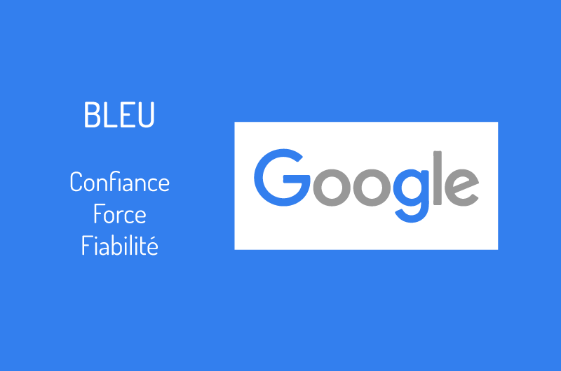
- The blue which is used for the two letters “g”: Trust, strength and reliability;
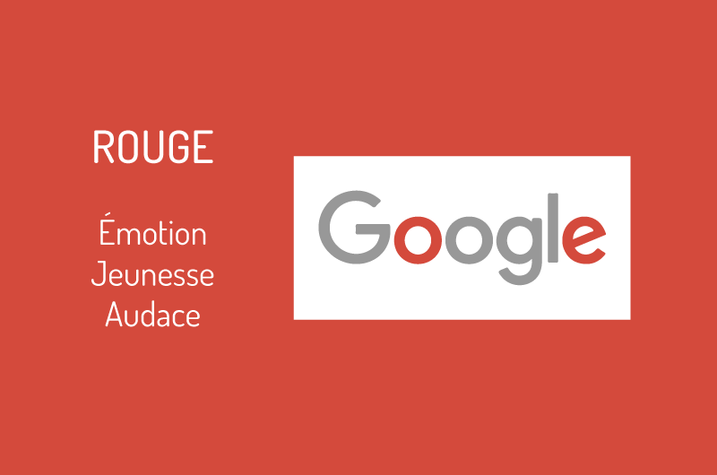
- The redused for the first letter “o” and the letter “e”: Emotion, youth and boldness;
- The yellow which is used for the second letter “o”: Optimism, clarity and warmth;

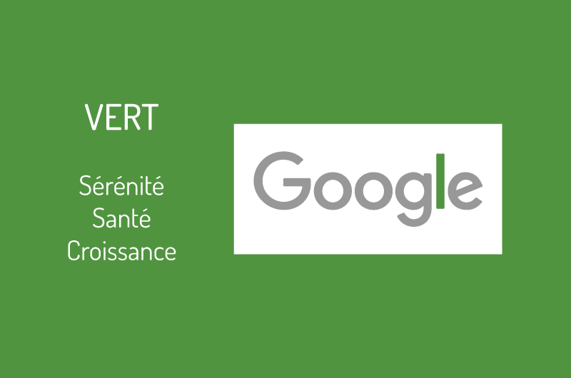
- The greenused for the letter ” l ” : Serenity, health and growth
The choice of these different colors is definitely not random, especially since the first three colors are first three colors are primary colors. In fact, they are the colors whose combination allows to have or create all the other existing shades, and this, according to the dosages of course [fusion_menu_anchor name=”3″ class=””][/fusion_menu_anchor]
In this measure, the American firm symbolically indicates that it intends to broaden its horizons to go beyond its own conventions.
The evolution of the Google logo since 1998
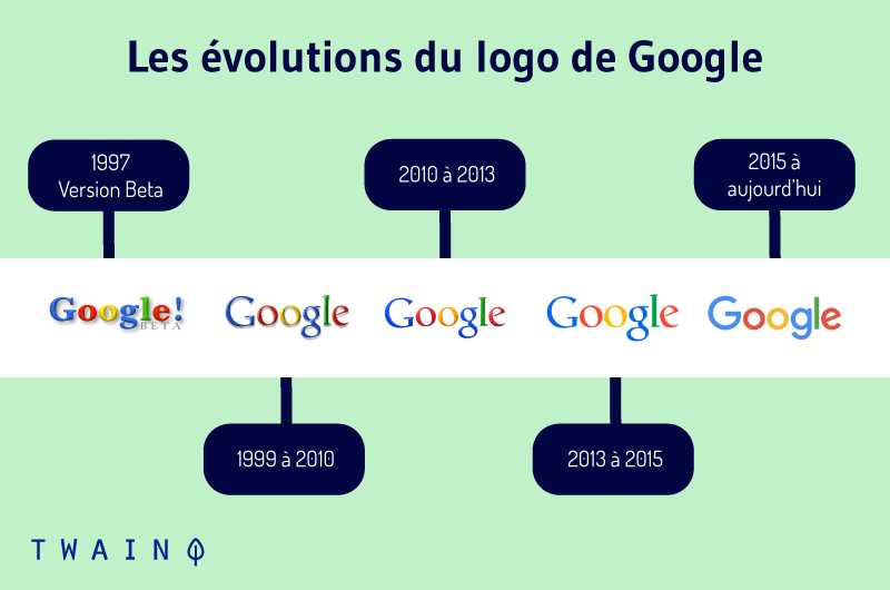
Since its creation, Google has changed its logo several times and here are the key dates and changes made.
September 1998
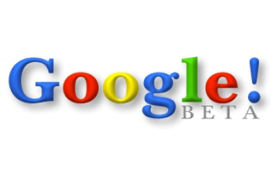
For their graduation project at Stanford, Larry Page and Sergey Brin create the Google logo. It will be Sergey Brin who will draw the logo with the open source image processing software: GIMP. He adds to the logo an exclamation mark that is clearly borrowed from Yahoo! which was very successful at the time.
May 1999
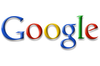
Less than a year later, a design teacher at Stanford University named Ruth Kedar designed the second Google logo. She takes care to keep the color scheme and presents a sophisticated rendering with the font “Catull”. The firm will maintain this logo until 2010, more than a decade.
May 2010
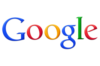
The third logo of Google was launched in a test version in November 2009, before being really implemented with the new interface of the engine in May 2010. This logo becomes much more real and vivid with some small changes.
In fact, the colors of the logo have become more vivid and the shading has been significantly reduced. At this level, we can see that the yellow now becomes orange.
Read More : TikTok to MP4 Converter – The Best Option You Can Use
September 2013
On the occasion of a considerable development of computer programs of the Windows operating system, Google makes some minor changes to its logo. This allows it to offer a new interface with a new logo.
The logo is flattened by virtue of the flat design that gives less room for relief effects. This makes the logo flat and its colors become even clearer.
September 2015 to present day
Since the year 1999, Google had maintained the same font for its logo. But the firm decided this time to change the font and create a font specifically dedicated to its logo: Product Sans.
Regarding the logos of the Mountain View firm, two other types of logos have undergone changes including Google Doodles and favicons.
Google Doodle : The adaptability of the logo
What is a Google Doodle and what is it for?
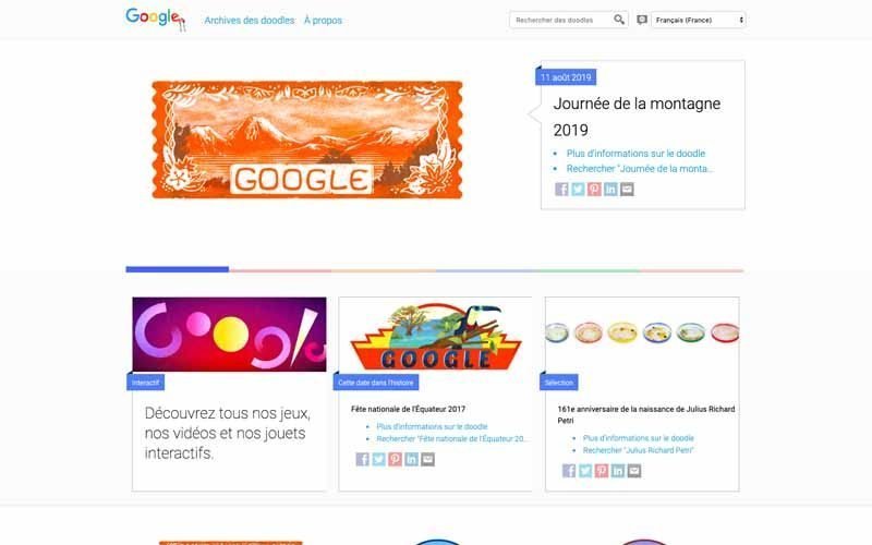
As a frequent user of Google, you have probably noticed that its logo is sometimes modified. These are the Google Doodles or Doodles that are usually posted within a day.
Indeed, Doodle is an English term that literally means “doodle” in French and Google uses them for :
- The celebration of a specific event a national holiday such as Christmas, the Olympics, the soccer world cup..
- Paying tribute to historical circumstances or to personalities.
The very first Doodles was created by the founders of Google to indicate their presence at the Burning Man festival in 1998. To create it, Google inserted a human-shaped silhouette in its logo to refer to the symbol of the event in question.
Since then, that is to say 1998, thousands of other Doodles were created until March 2011 when Sergey Brin filed a patent for Google Doodles indicating that the main purpose of these logos is nothing more than the ” promotion of a company “.
The different forms of Doodles
Generally, Doodles are displayed for one day, but the duration of the event may prompt Google to do it in a different way. In addition, depending on the scope of the eventdepending on the scope of the event, they can be displayed only in one country or in several countries at the same time.
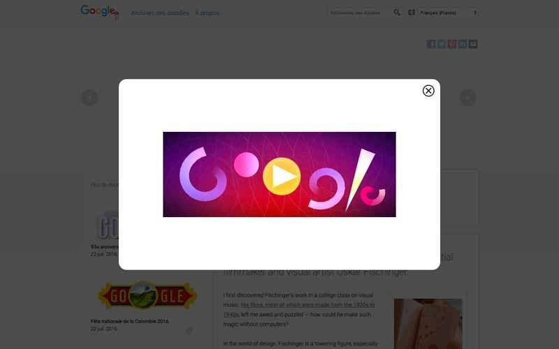
In terms of referencing, each Doodles has a URL that leads to a SERP that presents the pages describing the current event in the best way. This obviously leads to a spike in traffic of the websites that occupy the best positions for the said query. However, Google does not warn webmasters, which makes it difficult to apply SEO techniques for Doodles.
There are several types of Doodles namely:
- Simple images they are the most known;
Conclusion
Over the years, Google has been able to make a name for itself on the Web by becoming a major player on the world stage. In fact, the Mountain View firm has achieved tremendous growth since it has only existed for two decades. To understand this success, it is important to to look at its history and more precisely the origin of its name and logo.
Moreover, the changes that this logo and its derivatives have undergone over the years, show only one thing google’s visual identity is in step with the times. To this extent, it is quite likely that the American giant still makes changes to its logo in order to adapt to the trends of the period.


